


A business rebrand can be so beneficial for your business. In 2021 we took our own advice and completed our business rebrand from our 18 year old brand ‘CSQD’ to ‘Embark Agency’ and some of you have had front row seats to this evolution. Far more than just a name change, this was based on a 10 year strategy for our business rebrand. We are now uniquely positioned in our market having identified and focused on our ideal customers. The ones we love to work with and who give us even greater purpose to our craft and doing what we love.
Business rebrands are a long term strategy and also have an immeasurable impact on our brand reputation, job satisfaction both of which benefited the businesses bottom line (which is always important).
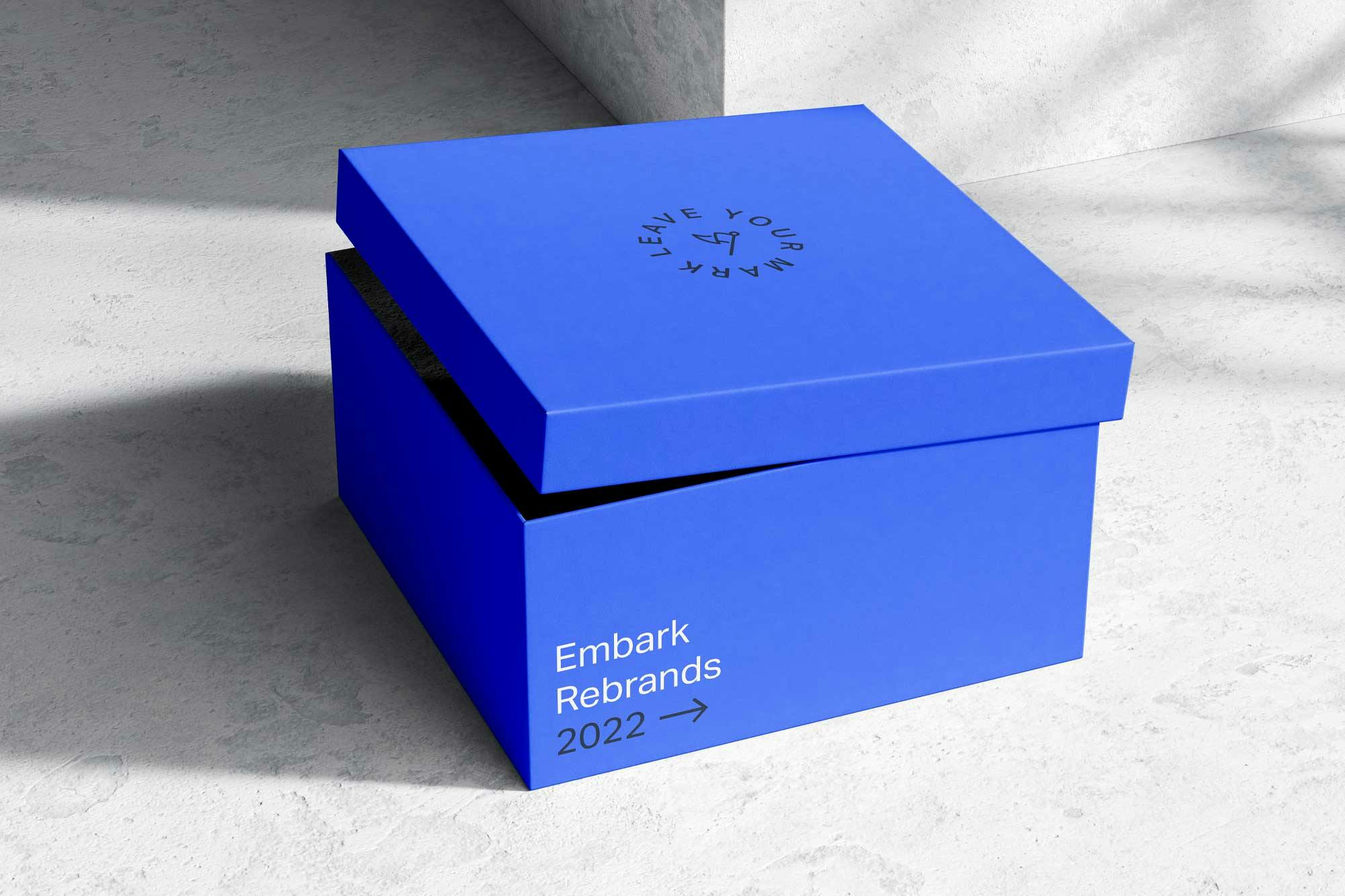
A strong brand can drive so much value to a business. Here are some of our favourite business rebrands from 2022.
1. Skie – Defining Possibility
Skie were disconnected from their brand. They felt it poorly represented them in the market, both compared to their competition but also from their ideal customers. Skie are one of the best at what they do. They are extremely passionate about helping their customers and it was time their brand represented this.
Opportunity:
If you google ‘Salesforce’ you will be hit with a very specific colour. A light blue / cyan colour which makes sense because afterall Salesforce is a cloud based service. However, every Salesforce integration company thought the same thing. That same blue was everywhere. For us to truly set Skie apart from its competitors, a colour change was essential. This is what we did for Skie’s business rebrand.


2. Touch Textiles – Inspiring creative expression
Based in beautiful Los Angeles California, EZ Fabric has a very successful business in the fabric world. The brand was completely misrepresented in the market and did not connect with their high end audience. Our job was to complete a brand strategy, identify their ideal audience, their competitors and create a new brand that would elevate them in the market and truly connect with their audience.
Opportunity:
The name EZ Fabric does not denote luxury. The first step in overhauling the brand was to explore a new name. Something that would tell their story and get their high end customers excited about getting their hands on their amazing fabric. This is what we did for the business rebrand and this is when Touch Textiles was born.


3. Humiscope – Master your indoors
Humiscope has engaged Embark Agency to create a new brand vision, direction and unique voice for the company. This entails consolidating three existing businesses into one strong brand. Currently Humiscope and Calroy are stand-alone businesses. A new product will also be part of this brand architecture. The goal is to amalgamate the three businesses under one strong banner, the Humiscope brand, with a unified voice.
Opportunity:
Creating strong value propositions for each of the brand offerings which align with the needs of the ideal clients will elevate Humiscope’s brand positioning and establish a greater market share. The goal is to align the brand identity with this new direction and create a solid foundation for the future of the business. This is what we did for the Humicsope business rebrand watch this space.


4. P3 Recovery – Live better, be better
When P3 Recovery’s owners bought this Gold Coast business they soon discovered that the previous owner had nearly run it into the ground. It was time to bring a very old and tired brand back into 2022, simply to remain relevant and competitive in the market.
Opportunity:
P3 Recovery was primarily a sports recovery center for elite athletes. However with the growing demand for and awareness about the health benefits of ice baths and saunas hitting mainstream it was time to transform this brand into a modern inclusive wellness brand for anyone looking to support their health and longevity. This is what we did for the P3 business rebrand


4. Mintbet – Make a game of it
Mintbet came to us looking to evolve and professionalise a tired brand. They also had specific requests and parameters for us to follow. Firstly, we had to use green. And secondly, we had to incorporate the man in the hat. The man in the hat represented the past, a family and generational history as it was the grandfather of the owner. Given these tight parameters we were determined to make it work and create a brand that not only tipped its hat to the past but also looked towards the future.
Opportunity:
With a tone of voice and personality of Australian + Fun + Friendly + Personal, the spy on the race track had to go. Enter a new fun and friendly mascot that perfectly represents Mintbet. The wink adds a little cheekiness, personality and youth to help connect to a younger generation. Here is what we did for the Mintbet business rebrand.


5. Pete’s Treeworx – The natural choice
Every once in a while we get a brand that has so much untapped potential we get really excited. Pete’s Treeworx was a complete professional rebrand which involved replacing a very dated and impractical logo along with a completely new website. The results speak for themselves.
Opportunity:
Tree surgeons everywhere don’t seem to value their brand. For starters, 9 out of 10 companies have chosen green for their brand. Yes they cut down trees and I guess it makes sense but for us there was a huge opportunity to do things differently. We lent into Pete’s brand positioning of ‘safety’ and used bright orange as the primary colour to really stand out in the market. Here’s what we did for the Pete’s Treeworx business rebrand.


5. APPS – Connecting possibility
Logos are the anchor to your brand. They should be simple, versatile, memorable and timeless. With APPS, they had a real problem. The brand identity was dated, generic and very hard to use across multiple applications. They were also lacking uniqueness in the market and were not sure what the future of their business would look like.
Opportunity:
Acronyms can be tricky to use and sometimes have negative connotations. Our job was to create a clever, unique and bold brand identity that represented piping without looking like pipes. Here is what we did for the APPS business rebrand.


7. Marker Apparel – The Competitive Edge
Rhino clothing had a very unique problem. They were not the only ‘rhino’ out there in the herd. Unfortunately the competitors were a much bigger company offering the same products and services. Rebranding not only became a question of need, it was essential for survival.
Opportunity:
Renaming and rebranding a business which is nearly 30 years old presents a huge responsibility and massive opportunity. We worked alongside the owners to create a new brand that would help identify and focus the business on their ideal customers and create a competitive edge. Enter the reinvention of Rhino clothing – Marker Apparel. Here is what we did for Marker’s business rebrand.


What’s involved in a business rebrand?
If you are not sure what a business rebrand entails, below is a list of deliverables we include depending on the package you decide to run with.
- Brand naming
- Tagline
- Brand positioning
- Brand messaging
- Tone of voice
- Brand style guide
- Brand story
- Competitor analysis
- Brand direction
Brand messaging
- Tagline
- Unique selling point
- Brand positioning statement
- Brand promise
- Brand values
- Brand personality
- Brand Story
- Unique logo creation based on strategy
- Typography for digital and print
- Colour scheme for digital and print
- Brand devices & assets
- Symbols or iconography
- Brand style guide
- Social media assets
- Graphic design for marketing collateral
If you think your business could do with a rebrand in 2023 or you want to know more about what we offer feel free to contact us anytime for an obligation free chat.